3.16.2.4.1 Parameter
The Parameter display element is the common component to display and edit most types of M&C parameters. Depending on the data type of the parameter (the data type is detected automatically) the parameter elements appears as textual / numeric entry field, choice box or as display field for read only parameters. In the screen editor, the parameter element is shown as a sunken rectangle.
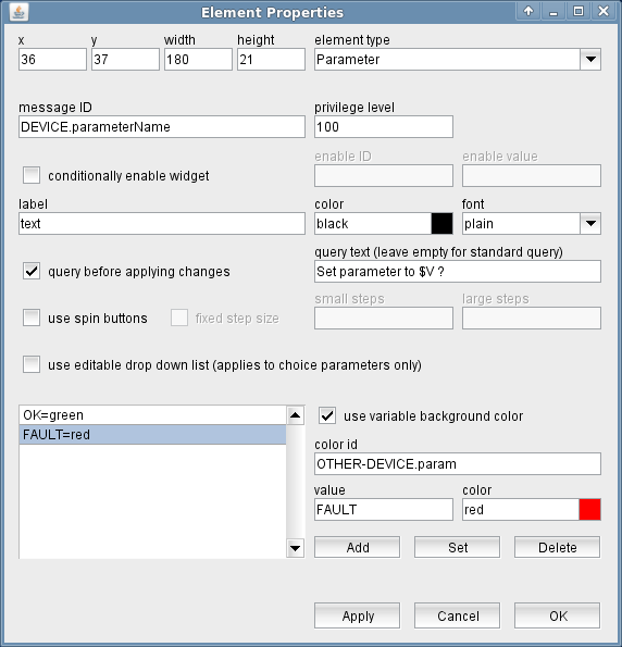
The attributes listed below may be configured to customize a display element of this type:
- message ID --- The message ID addresses the parameter the element shall display or edit. The message ID consists of the device name followed by a colon and the name of the parameter. XMIT-1.tx.on for example addresses the variable tx.on at a device named XMIT-1 . With the ' Device Driver Index ' in the appendix of this document there is a list of variable names provided for each device driver the software supports.
- privilege level --- The privilege level necessary to change this parameter. The predefined screens of the software use 100. In your own screens you may set certain parameters to higher privilege levels, limiting the group of operators permitted to change the parameter.
- conditionally enable widget --- Parameter fields may be locked to read only state unless another parameter matches a given value. For instance, changing the position of a wave guide switch may be inhibited while the carrier is switched on. Check this mark to activate this feature.
- enable ID --- This field defines the ID for the enabling parameter.
- value --- The value belonging to the parameter above. The actual value of the parameter addressed by "enable ID" mut match this value in order to enable the entry field.
- label --- The label text is drawn above the element.
- color --- The color attribute of a parameter element sets the color of the label shown above the entry field. The text in the parameter field itself always is shown in the default text color of the selected look & feel. Colors may be specified by standard color names like red / green / blue or using a hexadecimal RGB notation. '#FFFF00' for example specifies yellow. You may click to the color example field in order to open a color chooser dialog and select the color from there.
- font --- The font attribute applies to the text shown in the parameter field itself. The label text is shown with the standard ("plain") font size for all font selections except the smallest one. In the latter case the label is drawn using this small font size, too.
- query before applying changes --- Check this mark to make the element show a query before a parameter gets actually commanded.
- query text --- The query text to be shown in the pop-up window. you may leave this field empty, the program uses a standard query text in this case.In the question text, placeholders may used for two values: Any occurrences of the pattern $P get replaced by the parameter name (message ID). Any occurrences of the pattern $V get replaced by the new value to set.
- use spin buttons --- Checking this mark enables "spin buttons" for numeric entry fields. Clicking these small arrow symbols at the right edge of the entry field increases/decreases the value by a certain amount. clicking them with the right mouse button increases/decreases by a larger amount.Enabling spin buttons with automatic step size automatically enables the "use editable drop down list" feature.
- fixed step size --- Checking this mark permits to set user defined increment values for the spin buttons. If not checked, the spin button increment is derived from the least significant digit shown in the field, the large (right mouse button) increment is ten time that.
- small steps --- The spin button increment value to be applied with left mouse button clicks.
- large steps --- The right mouse button spin button increment. The program assumes 10 times the small steps if the large steps field is left empty.
- use editable drop down list / force single click select --- Checking this mark changes the type of drop down list to be used with a choice parameter.Enumerated values normally are shown as a drop down list which pops up if you click into the field. This element type is not keyboard sensitive, you always have to select the value with the mouse which may be inconvenient if the list contains a large number of values.With the editable drop down list option checked you can type into the field and write some characters of the new value you want to set. The element pops up a list of applicable setting containing the typed characters. Clicking to the selected value in the list completes the selection, sets the value.If the widget is configured for a height of 40 pixels or more, it appears as a scrollable list rather than as a drop down box. Checking this mark forces the widget to select a value with a single mouse click, normally a double click is required to select a value.Selecting this option automatically enables "use spin buttons".
- use variable background color --- Checking this mark enables the variable background color feature for this screen element. Depending on the actual value of the variable addressed by 'color id', the element's background is set using the translation table shown in the lower left corner of the dialog. If the actual value of the color id variable does not match any of the table entries or if no color id is specified, the first color in the list is used to draw the element's background.The buttons Add/Set/Delete along with the value and color fields are used to edit the color translation table.
- color id --- The message ID of the parameter which controls the background color of this element.
- value --- The parameter value of the actually selected table entry
- color --- The color specification of the actually selected table entry. This may either be the name of a basic color (red, yellow etc.) or a hexadecimal RGB color specification like '#FF8000'. The latter defines some sort of orange, consisting of 0xFF red, 0x80 green and 0x00 blue. The actually selected color is shown in the right part of the entry field, clicking to this opens a color chooser dialog which lets you select / compose the the color to your needs.
- Add / Set / Delete --- These buttons control editing the color translation list.
- To add a new value / color pair to the list, fill the value and color fields, then click to "Add".
- To change the color assigned to a given parameter value, first select the table entry of interest, change the color value and finally click "Set".
- To delete a value / color pair from the list, select the table entry and then click "Delete".
Remarks
- The options "use spin buttons" (automatic step size) and "use editable drop down list" internally use the same use the same property of the screen element. Hence, these options are linked in way that if you enable one of these options, the other one is selected as well. This is done to maintain compatibility to older versions of the software. This linkage means no limitation, as a parameter element never can be a numeric entry field and a choice list at the same time.
- The predefined screens of the software always use the "plain" font and a height of 21 pixels for parameter fields.
- If you enlarge the height for a choice parameter widget to more than 40 pixels, the software uses a list widget with scroll bars rather than a drop down selection box.
- If you enlarge the height for a entry field to more than 50 pixels, the software uses a multi line entry field widget. Multi line entry fields are useful only for very few types of parameters, they are not recommended for general use.