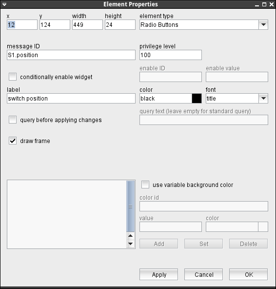
The Radio Buttons display element is a component to display and edit CHOICE type M&C parameters as a number of radio buttons. Depending on the height of the element, radio buttons are positioned in a row or in a column. In the screen editor, the parameter element is shown as a simple rectangle rectangle.
The attributes listed below may be configured to customize a display element of this type:
- message ID --- The message ID addresses the parameter the element shall display or edit. The message ID consists of the device name followed by a colon and the name of the parameter. XMIT-1.tx.on for example addresses the variable tx.on at a device named XMIT-1 . With the ' Device Driver Index ' in the appendix of this document there is a list of variable names provided for each device driver the software supports.
- privilege level --- The privilege level necessary to change this parameter. The predefined screens of the software use 100. In your own screens you may set certain parameters to higher privilege levels, limiting the group of operators permitted to change the parameter.
- conditionally enable widget --- Parameter fields may be locked to read only state unless another parameter matches a given value. For instance, changing the position of a wave guide switch may be inhibited while the carrier is switched on. Check this mark to activate this feature.
- enable ID --- This field defines the ID for the enabling parameter.
- value --- The value belonging to the parameter above. The actual value of the parameter addressed by "enable ID" mut match this value in order to enable the entry field.
- label --- The label text is drawn above the element.
- color --- The color attribute of a parameter element sets the color of the label shown above the entry field. The text in the parameter field itself always is shown in the default text color of the selected look & feel. Colors may be specified by standard color names like red / green / blue or using a hexadecimal RGB notation. '#FFFF00' for example specifies yellow. You may click to the color example field in order to open a color chooser dialog and select the color from there.
- font --- The font attribute applies to the text shown in the parameter field itself. The label text is shown with the standard ("plain") font size for all font selections except the smallest one. In the latter case the label is drawn using this small font size, too.
- query before applying changes --- Check this mark to make the element show a query before a parameter gets actually commanded.
- query text --- The query text to be shown in the pop-up window. you may leave this field empty, the program uses a standard query text in this case.In the question text, placeholders may used for two values: Any occurrences of the pattern $P get replaced by the parameter name (message ID). Any occurrences of the pattern $V get replaced by the new value to set.
- draw frame --- Checking this mark makes the element show a rectangular frame around the radio buttons.
- use variable background color --- Checking this mark enables the variable background color feature for this screen element. Depending on the actual value of the variable addressed by 'color id', the element's background is set using the translation table shown in the lower left corner of the dialog. If the actual value of the color id variable does not match any of the table entries or if no color id is specified, the first color in the list is used to draw the element's background.The buttons Add/Set/Delete along with the value and color fields are used to edit the color translation table.
- color id --- The message ID of the parameter which controls the background color of this element.
- value --- The parameter value of the actually selected table entry
- color --- The color specification of the actually selected table entry. This may either be the name of a basic color (red, yellow etc.) or a hexadecimal RGB color specification like '#FF8000'. The latter defines some sort of orange, consisting of 0xFF red, 0x80 green and 0x00 blue. The actually selected color is shown in the right part of the entry field, clicking to this opens a color chooser dialog which lets you select / compose the the color to your needs.
- Add / Set / Delete --- These buttons control editing the color translation list.
- To add a new value / color pair to the list, fill the value and color fields, then click to "Add".
- To change the color assigned to a given parameter value, first select the table entry of interest, change the color value and finally click "Set".
- To delete a value / color pair from the list, select the table entry and then click "Delete".