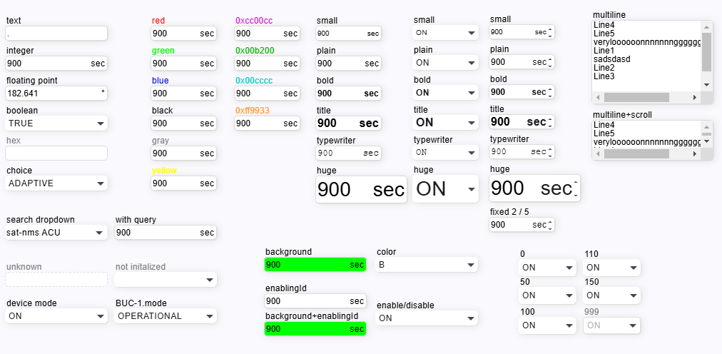
The ParameterElement is the common component to display and edit most types of M&C parameters. Depending on the data type of the parameter (the data type is detected automatically) the parameter elements appears as textual / numeric entry field, choice box or as display field for read only parameters.
In the image below are the all variants of parameter element.
Widget Variants: Depending on the type of parameter and on the height parameter there are different widget types associated with the ParameterElement. As the parameter type is not known at the time the screen definition is read, the decision what widget type shall be used must be done after the parameter type description has been received from the server.
| Parameter Type | height < 40 | height >= 40 |
|---|---|---|
| Text | single line entry field | multi line entry field, scrollable if text does not fit into the field |
| Numeric | single line entry field | single line entry field |
| Enum/Choice | drop down or combo box | scrollable list selection |
| r/o Text | single line display | multi line display, scrollable if text does not fit into the field |
| r/o Numeric | single line display | single line display |
| r/o Enum/Choice | single line display | single line display |
Spin Buttons: With useSpinButtons set 'true', the ParameterElement shows spin buttons with editable numeric values. The spin buttons allow to increment/decrement the value by clicking on them. By default, a spin button click increments or decrements the lowest significant digit shown in the entry field. With the shift key hold down, the effective increment is x10. The above applies if the spinSmallIncrement / spinLargeIncrement properties are empty. If set, these values override the defaults.
Unsaved changes
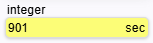
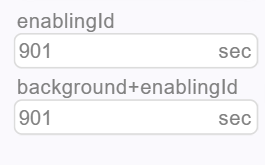
If you have changed the value of any parameter element, the background of the input field turns yellow. As soon as you have saved the changes by pressing the Enter key or leaving the input field, the background color of the input field returns to normal.
Element disabled
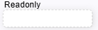
Element readonly
Readonly elements is displayed with dashed border with grey text color.
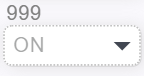
Element disabled because of low privilege level
Elements is displayed with dotted border with grey text color.