The Latching Button display element works much like the Parameter Button element described in the previous chapter, but specialized to show and control an enumeration parameter which knows exactly two states (e.g. on/off or true/false).
When the operator changes the state of the button by clicking it once, the latching button sends the 'other' parameter value to the device. On the other hand, if some other instance in the system changes the parameter state, the latching button recognizes this and changes the up/down state of the button accordingly.
Like the parameter button, the latching button may be labeled with text or an image. To reflect the actual state, the latching button always is configred with two text string or two image names which are shown according to the actual parameter value.
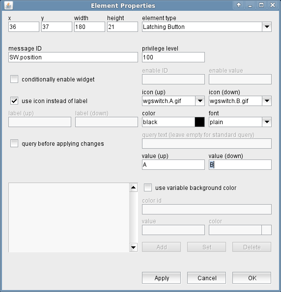
The attributes listed below may be configured to customize a display element of this type:
- message ID --- The message ID addresses the parameter the button shall control. The message ID consists of the device name followed by a colon and the name of the parameter. XMIT-1.tx.on for example addresses the variable tx.on at a device named XMIT-1 . With the ' Device Driver Index ' in the appendix of this document there is a list of variable names provided for each device driver the software supports.
- privilege level --- The privilege level necessary to access this button. The predefined screens of the software use 100. In your own screens you may set certain parameters to higher privilege levels, limiting the group of operators permitted to change the parameter.
- conditionally enable widget --- Parameter buttons may be locked to disabled state unless another parameter matches a given value. For instance, changing the position of a wave guide switch may be inhibited while the carrier is switched on. Check this mark to activate this feature.
- enable ID --- This field defines the ID for the enabling parameter.
- value --- The value belonging to the parameter above. The actual value of the parameter addressed by "enable ID" mut match this value in order to enable the button.
- use icon instead or label --- Check this mark in order to make the button show an icon instead of a label text.
- icon (up) --- The name of the icon to be shown in "up" state of the button. The field provides a list of all available icons / images on the sat-nms server.
- icon (down) --- The name of the icon to be shown in "down" state of the button. The field provides a list of all available icons / images on the sat-nms server.
- label (up) --- This label text is drawn on the button in "up" state.
- label (down) --- This label text is drawn on the button in "down" state.
- color --- The color attribute of a parameter element sets the color of the label shown on the button. Colors may be specified by standard color names like red / green / blue or using a hexadecimal RGB notation. '#FFFF00' for example specifies yellow. You may click to the color example field in order to open a color chooser dialog and select the color from there.
- font --- The font to be used for the button label.
- query before applying changes --- Check this mark to make the element show a query before a parameter gets actually commanded.
- query text --- The query text to be shown in the pop-up window. you may leave this field empty, the program uses a standard query text in this case.In the question text, placeholders may used for two values: Any occurrences of the pattern $P get replaced by the parameter name (message ID). Any occurrences of the pattern $V get replaced by the new value to set.
- value (up) --- The value to be sent when the button is clicked an changes to "up" state.
- value (down) --- The value to be sent when the button is clicked an changes to "down" state.
- use variable background color --- Checking this mark enables the variable background color feature for this screen element. Depending on the actual value of the variable addressed by 'color id', the element's background is set using the translation table shown in the lower left corner of the dialog. If the actual value of the color id variable does not match any of the table entries or if no color id is specified, the first color in the list is used to draw the element's background.The buttons Add/Set/Delete along with the value and color fields are used to edit the color translation table.
- color id --- The message ID of the parameter which controls the background color of this element.
- value --- The parameter value of the actually selected table entry
- color --- The color specification of the actually selected table entry. This may either be the name of a basic color (red, yellow etc.) or a hexadecimal RGB color specification like '#FF8000'. The latter defines some sort of orange, consisting of 0xFF red, 0x80 green and 0x00 blue. The actually selected color is shown in the right part of the entry field, clicking to this opens a color chooser dialog which lets you select / compose the the color to your needs.
- Add / Set / Delete --- These buttons control editing the color translation list.
- To add a new value / color pair to the list, fill the value and color fields, then click to "Add".
- To change the color assigned to a given parameter value, first select the table entry of interest, change the color value and finally click "Set".
- To delete a value / color pair from the list, select the table entry and then click "Delete".